Series: Consumption
Model: TSLM
Residuals:
Min 1Q Median 3Q Max
-0.90555 -0.15821 -0.03608 0.13618 1.15471
Coefficients:
Estimate Std. Error t value Pr(>|t|)
(Intercept) 0.253105 0.034470 7.343 5.71e-12 ***
Income 0.740583 0.040115 18.461 < 2e-16 ***
Production 0.047173 0.023142 2.038 0.0429 *
Unemployment -0.174685 0.095511 -1.829 0.0689 .
Savings -0.052890 0.002924 -18.088 < 2e-16 ***
---
Signif. codes: 0 '***' 0.001 '**' 0.01 '*' 0.05 '.' 0.1 ' ' 1
Residual standard error: 0.3102 on 193 degrees of freedom
Multiple R-squared: 0.7683, Adjusted R-squared: 0.7635
F-statistic: 160 on 4 and 193 DF, p-value: < 2.22e-16Evaluating your time series regression
BUS 323 Forecasting and Risk Analysis
Residuals: assumptions
Assumed to have average of zero: \[ \sum_{t=1}^{T} e_{t} = 0 \]
Assumed to have zero correlation with regressors:
\[ \sum_{t=1}^{T} x_{k,t} e_{t} = 0 \text{ }\forall \text{ } k \].
Residuals: assumptions
- It’s important to check that these assumptions hold after estimating a regression model.
Baseline regression
- Recall our time series regression for the
us_changedataset:
mr_c <- us_change |>
  model(TSLM(Consumption ~ Income + Production + Unemployment + Savings))
report(mr_c)
Baseline regression
- Recall our time series regression for the
us_changedataset:
Residual plots
- When you use
TSLM()you can generate residual plots withgg_tsresiduals():
mr_c |>
  gg_tsresiduals()
Residual plots
- When you use
TSLM()you can generate residual plots withgg_tsresiduals():
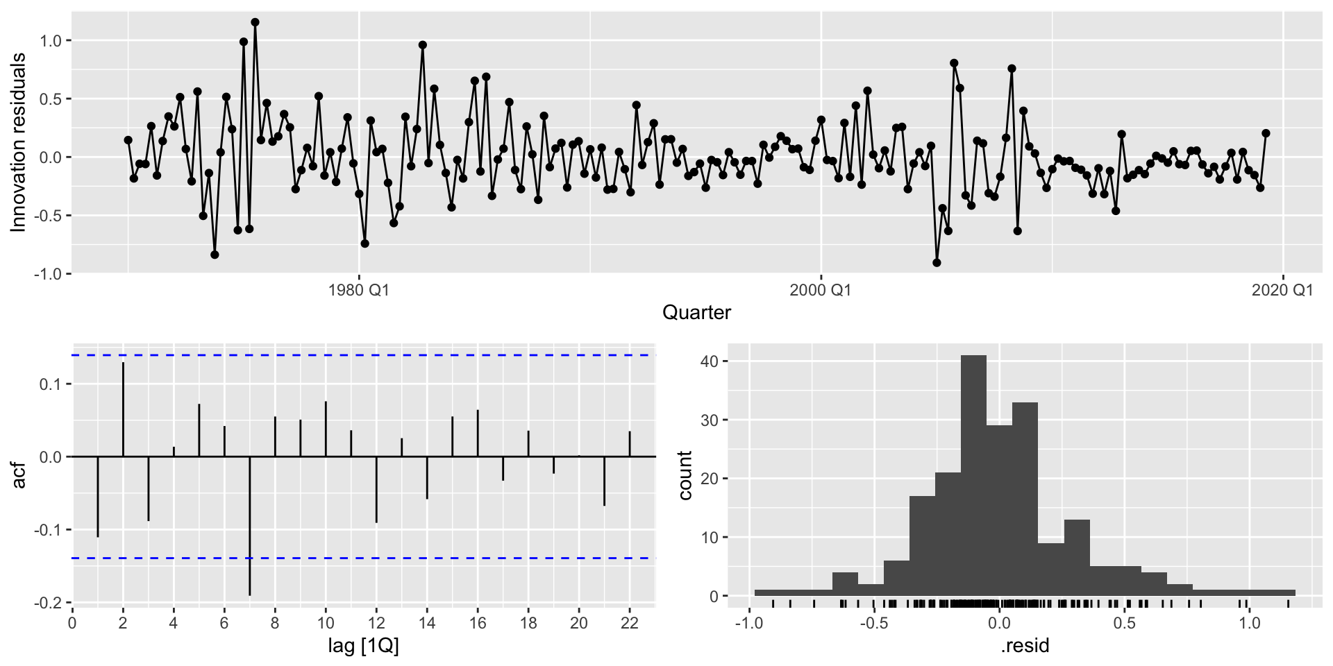
Autocorrelation tests
- The ACF plot is a neat visual check for autocorrelation.
- Implicit single hypothesis tests in relying on it
- For a joint hypothesis test, use portmanteau tests.
Box-Pierce
- The Box-Pierce test is based on the following statistic: \[ Q = T \sum_{k=1}^{l} r_{k}^{2} \] where \(l\) is the maximum lag under consideration; \(T\) is the total number of time periods (observations, in a time series).
- If all \(r_{k}\) are small, \(Q\) will also be small.
- Rule of thumb:
- Use \(l=10\) for non-seasonal data
- Use \(l = \frac{T}{5}\) for seasonal data.
Hypothesis testing
- Hypothesis testing proceeds as usual here. Compare \(Q\) to the \(\chi^{2}\) distribution critical value at your chosen level of significance.
Rwill give you the \(p\)-value associated with the hypothesis test directly, so you can just use that in practice. Compare the \(p\)-value to your chosen level of significance \(\alpha\). If \(p<\alpha\), you can reject \(H_{0}\) at that level of significance.
Ljung-Box
- The Ljung-Box test is more commonly used.
- At higher lag values, autocorrelations tend to become noisy.
- Ljung-Box adds weights to account for the noise at higher lag values.
- Ljung-Box also approximates the \(\chi^{2}\) distribution better than Box-Pierce: \[ Q^{*} = T(T+2) \sum_{k=1}^{l} \frac{r_{k}^{2}}{T-k} \]
Implementing Box-Pierce
- To implement easily, use
augment()andfeatures():
augment(mr_c) |>
  features(.innov, box_pierce, lag = 10)
# A tibble: 1 × 3
.model bp_stat bp_pvalue
<chr> <dbl> <dbl>
1 TSLM(Consumption ~ Income + Production + Unemployment + Sav… 18.2 0.0518Implementing Ljung-Box
- Similar set-up for Ljung-Box:
augment(mr_c) |>
  features(.innov, ljunbg_box, lag = 10)
# A tibble: 1 × 3
.model lb_stat lb_pvalue
<chr> <dbl> <dbl>
1 TSLM(Consumption ~ Income + Production + Unemployment + Sav… 18.9 0.0420Checking the zero conditional mean assumption
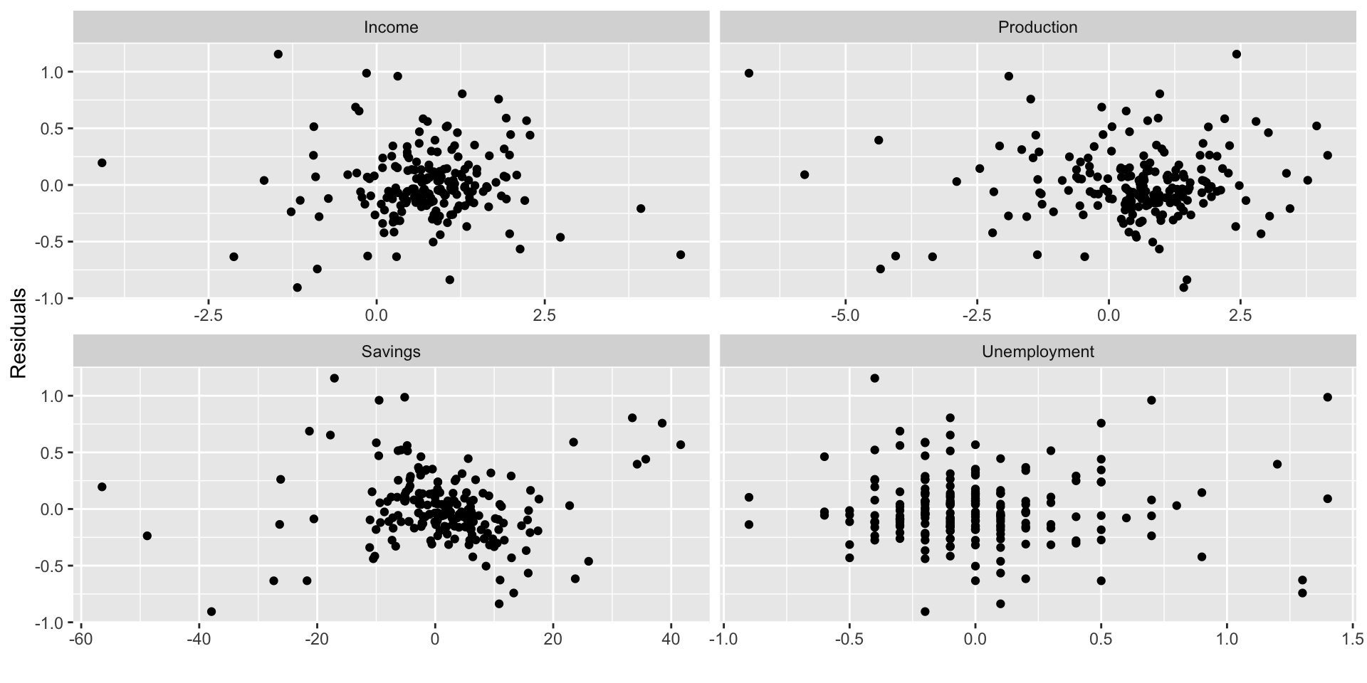
- One of the Gauss-Markov assumptions underlying regression estimation via OLS is \[ E(e | X) = 0. \]
- We can check how well our regression satisfies this assumption visually by scattering the residuals against each predictor variable.
- It’s not a bad idea to scatter the residuals against excluded predictor variables to make sure they aren’t relevant.
Making scatterplots
- First, we’ll need to add the residuals to the
us_changedataset:
us_change |>
  left_join(residuals(mr_c), by = "Quarter")
Making scatterplots
- Next we’ll want to turn the variables for plotting into long form:
us_change |>
  left_join(residuals(mr_c), by = "Quarter") |>
  pivot_longer(Income:Unemployment,
               names_to = "regressor", values_to = "x")
Making scatterplots
- Finally we can use
facet_wrapto add four plots to one plot area:
us_change |>
  left_join(residuals(mr_c), by = "Quarter") |>
  pivot_longer(Income:Unemployment,
               names_to = "regressor", values_to = "x") |>
  ggplot(aes(x = x, y = .resid)) +
  geom_point() +
  facet_wrap(. ~ regressor, scales = "free_x") +
  labs(y = "Residuals", x = "")
Making scatterplots
- Finally we can use
facet_wrapto add four plots to one plot area:
Residual plots against fitted values
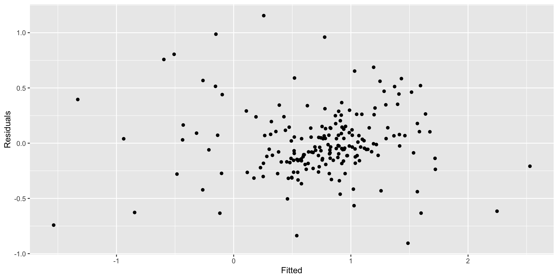
- We also want to see no relationship between the residuals and the predictions from our model.
- You can access the predicted (fitted) values from a time series regression object by calling it:
augment(mr_c)$.fitted - You can access the residuals similarly:
augment(mr_c)$.resid - Plotting is simple once you’ve got those:
augment(mr_c) |>
  ggplot(aes(x = .fitted, y = .resid)) +
  geom_point() + labs(x = "Fitted", y = "Residuals")
Residual plots against fitted values
Forecasting with regression
- Recall predicted values can be obtained via \[ \hat{y}_{t} = \hat{\beta}_{0} + \hat{\beta}_{1} x_{1,t} + ... + \hat{\beta}_{k,t} \] Plugging in observed values of the regressors for a given \(t\) will return the relevant prediction for \(y\). But we are interested in forecasting values of \(y\), for which \(x\) are not observed.
Ex-ante forecasts
- Ex-ante forecasts are genuine forecasts, based only on existing observations and extending beyond the period of observation. To make ex ante predictions, we’ll need forecasts of the to forecast the regressand.
- We’ll talk over some simple methods for forecasting predictors next time, then more sophisticated approaches later on.
Ex-post forecasts
- Ex-post forecasts are made using observed values. So you’d define a “forecast period”, use only observations prior to that period to “train” your regression, then generate an ex-ost forecast for the forecast period.
- Ex-post forecasting is useful for testing and evaluating your model.
A couple of useful predictors
- Before we do our first forecast, let’s define a couple of useful predictors that exist within a given time series and can be forecasted forward really easily.
Trend
- A linear trend can be modeled by using \(t\) as a predictor: \[ y_{t} = \beta_{0} + \beta_{1} t + \epsilon_{t} \]
- You can add a linear trend to a
TSLM()command with thetrend()option.
Dummy variables
- A dummy variable is one that is equal to 1 when a given condition is met and is equal to 0 otherwise.
- These are useful for accounting for outliers, among other things
- e.g. If your time series of retail sales includes Labor Day, when demand might be abnormally high, you might want to include a variable that accounts for the effect of Labor Day separate from your other predictors.
- If you want to account for seasonal differences with dummy variables, you can do so easily with the
season()option inTSLM().
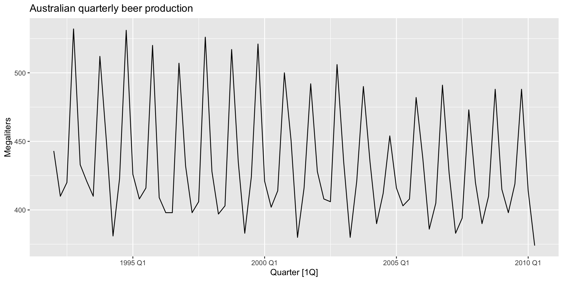
Example: beer production
recent_production <- aus_production |>
  filter(year(Quarter) >= 1992)
# A tsibble: 6 x 7 [1Q]
Quarter Beer Tobacco Bricks Cement Electricity Gas
<qtr> <dbl> <dbl> <dbl> <dbl> <dbl> <dbl>
1 1992 Q1 443 5777 383 1289 38332 117
2 1992 Q2 410 5853 404 1501 39774 151
3 1992 Q3 420 6416 446 1539 42246 175
4 1992 Q4 532 5825 420 1568 38498 129
5 1993 Q1 433 5724 394 1450 39460 116
6 1993 Q2 421 6036 462 1668 41356 149Example: beer production
Example: beer production
- Let’s estimate a model with a linear trend and seasonal dummies. Since the seasonality is quarterly, we’ll want quarter dummies: \[ y_{t} = \beta_{0} + \beta_{1} t + \beta_{2} d_{2,t} + \beta_{3} d_{3,t} + \beta_{4} d_{4,t} + \epsilon_{t} \]
Example: beer production
To implement in R:
lm_beer <- recent_production |>
  model(TSLM(Beer ~ trend() + season()))
report(lm_beer)
Series: Beer
Model: TSLM
Residuals:
Min 1Q Median 3Q Max
-42.9029 -7.5995 -0.4594 7.9908 21.7895
Coefficients:
Estimate Std. Error t value Pr(>|t|)
(Intercept) 441.80044 3.73353 118.333 < 2e-16 ***
trend() -0.34027 0.06657 -5.111 2.73e-06 ***
season()year2 -34.65973 3.96832 -8.734 9.10e-13 ***
season()year3 -17.82164 4.02249 -4.430 3.45e-05 ***
season()year4 72.79641 4.02305 18.095 < 2e-16 ***
---
Signif. codes: 0 '***' 0.001 '**' 0.01 '*' 0.05 '.' 0.1 ' ' 1
Residual standard error: 12.23 on 69 degrees of freedom
Multiple R-squared: 0.9243, Adjusted R-squared: 0.9199
F-statistic: 210.7 on 4 and 69 DF, p-value: < 2.22e-16Example: beer production
Plot fitted values against observed values:
augment(lm_beer) |>
  ggplot(aes(x = Quarter)) +
  geom_line(aes(y = Beer, colour = "Data")) +
  geom_line(aes(y = .fitted, colour = "Fitted")) +
  scale_colour_manual(
    values = c(Data = "black", Fitted = "orange")
  ) +
  labs(y = "Megaliters",
       title = "Australian quarterly beer production") +
  guides(colour = guide_legend(title = "Series"))
Example: beer production
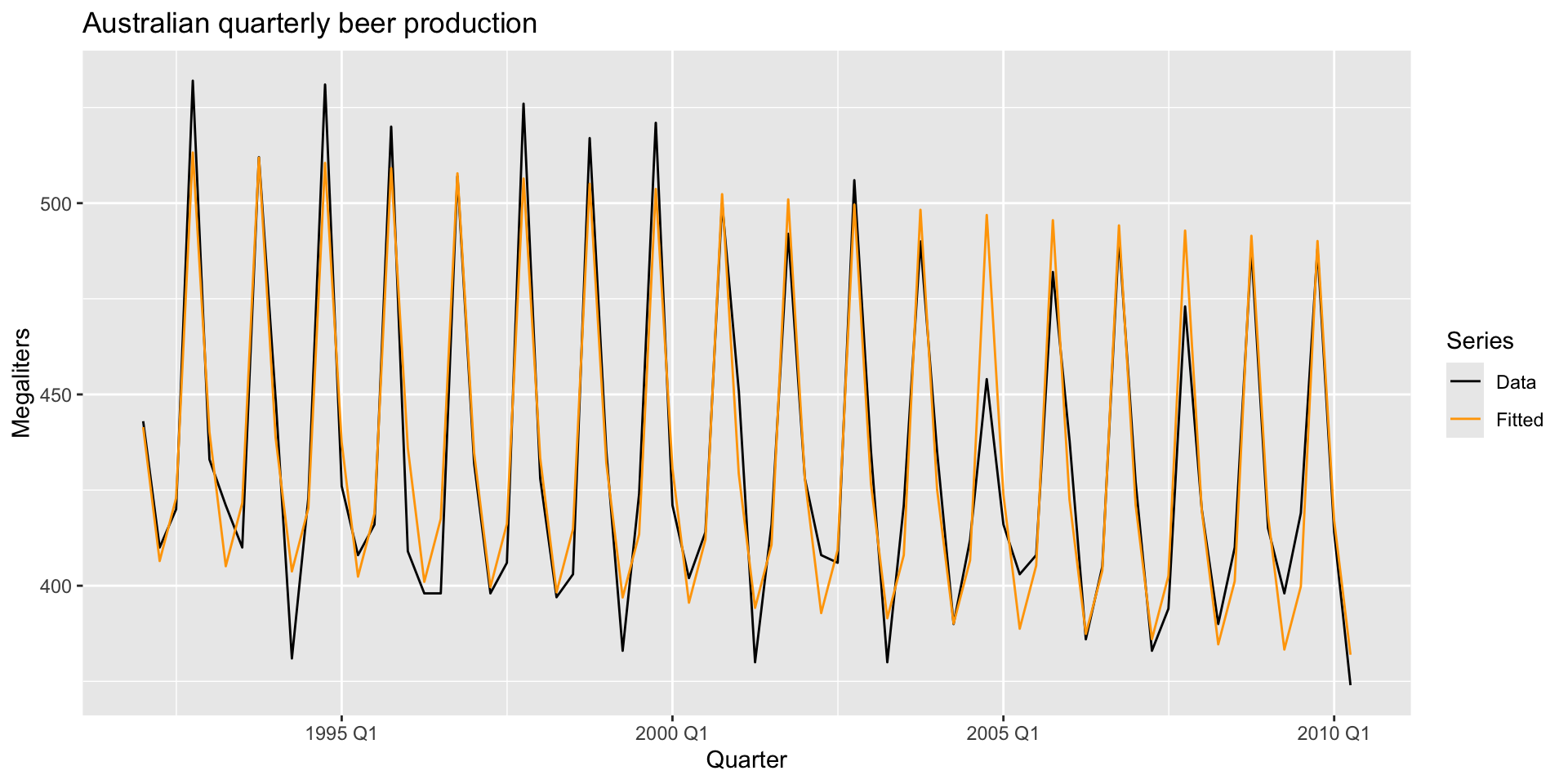
- Try taking the season dummies out and see how the fit looks. Try taking the trend out and see how the fit looks.
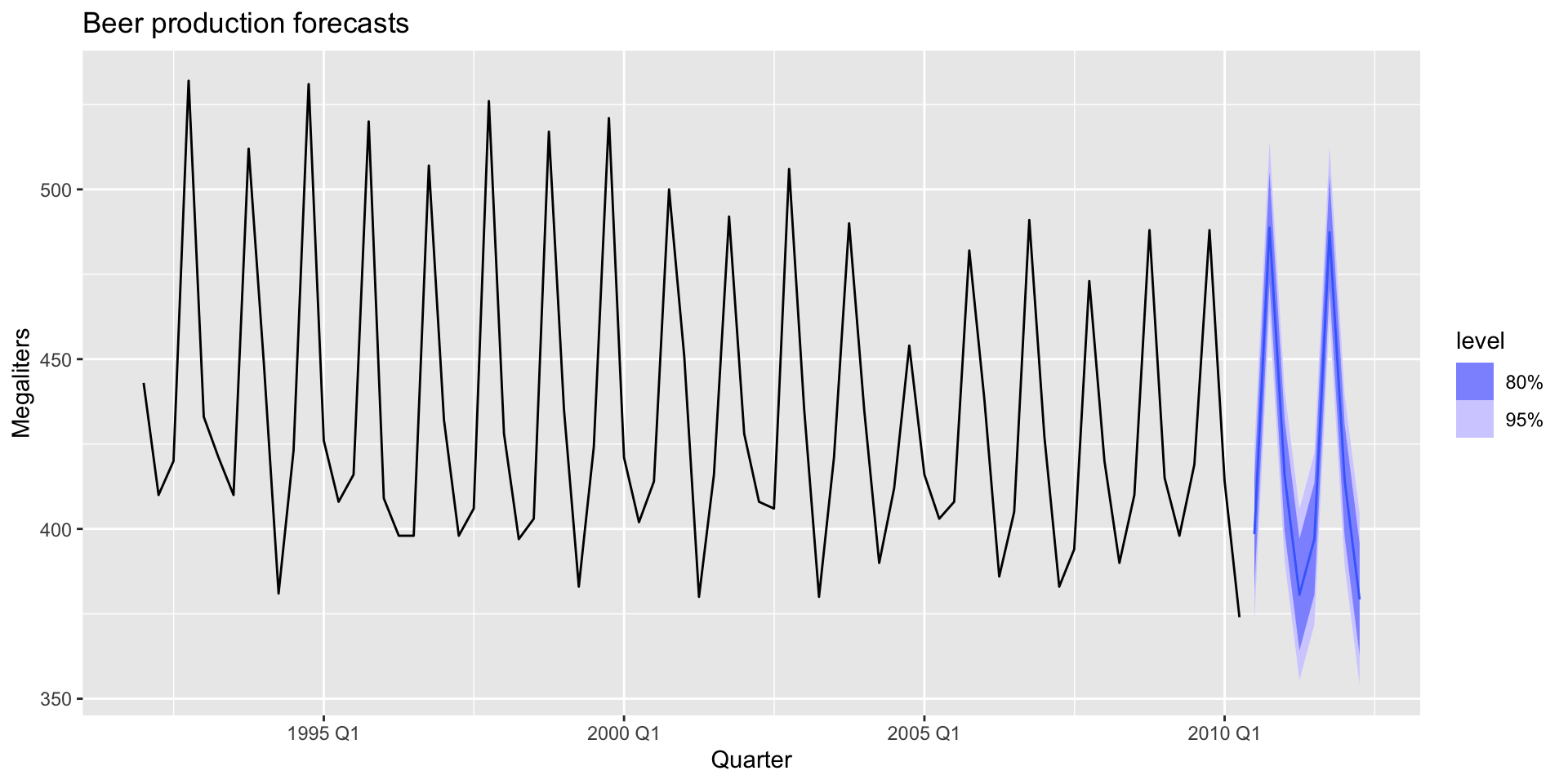
Let’s forecast!
- You can make a forecast easily if you have forecasts for the predictors pretty easily, with the
forecast()function:
fc_beer <- forecast(lm_beer)
fc_beer |>
  autoplot(recent_production) +
  labs(
  title = "Beer production forecasts",
  y = "Megaliters"
  )
Let’s forecast!
Scenario based forecasting
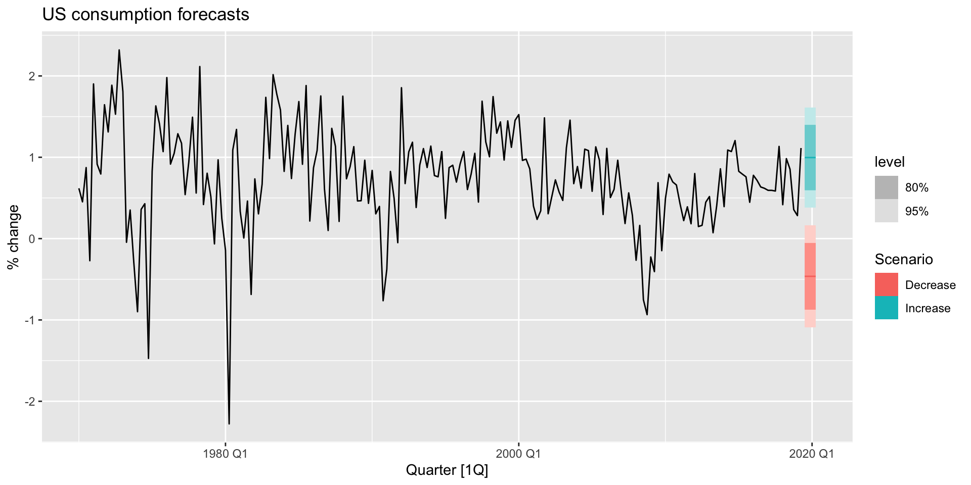
- Suppose we want to forecast consumption change in the US under the assumption that unemployment remains constant, but income increases by 1% and savings increase by 0.5%. We’d like another scenario where income decreases by 1% andf savings decrease by 0.5%. We can use the
scenarios()function to build new datasets that include our scenarios, and thenew_data()function to define how far forward we’d like to forecast. - Base model:
lm_uschange <- us_change |>
  model(
    lm = TSLM(Consumption ~ Income + Savings + Unemployment)
    )
Scenario based forecasting
- Building our scenarios:
future_scenarios <- scenarios(
  Increase = new_data(us_change, 4) |>
    mutate(Income=1, Savings=0.5, Unemployment=0),
  Decrease = new_data(us_change, 4) |>
    mutate(Income=-1, Savings=-0.5, Unemployment=0),
names_to = "Scenario")- Check what these data look like now.
Scenario based forecasting
- Let’s make our forecasts:
fc_uschange <- forecast(lm_uschange, new_data = future_scenarios)Scenario based forecasting
- And plot:
us_change |>
  autoplot(Consumption) +
  autolayer(fc_uschange) +
  labs(title= "US consumption forecasts", y = "% change")