More time series graphics
BUS 323 Forecasting and Risk Analysis
Seasonal plots
- Seasonal plots disaggregate a time series into “seasons”.
- I’m going to work with the antidiabetic drug sales object we made last time to start:
library(fpp3)
a10 <- PBS |>
  filter(ATC2 == "A10") |>
  select(Month, Concession, Type, Cost) |>
  summarise(TotalC = sum(Cost)) |>
  mutate(Cost = TotalC/1e6)
Seasonal plots
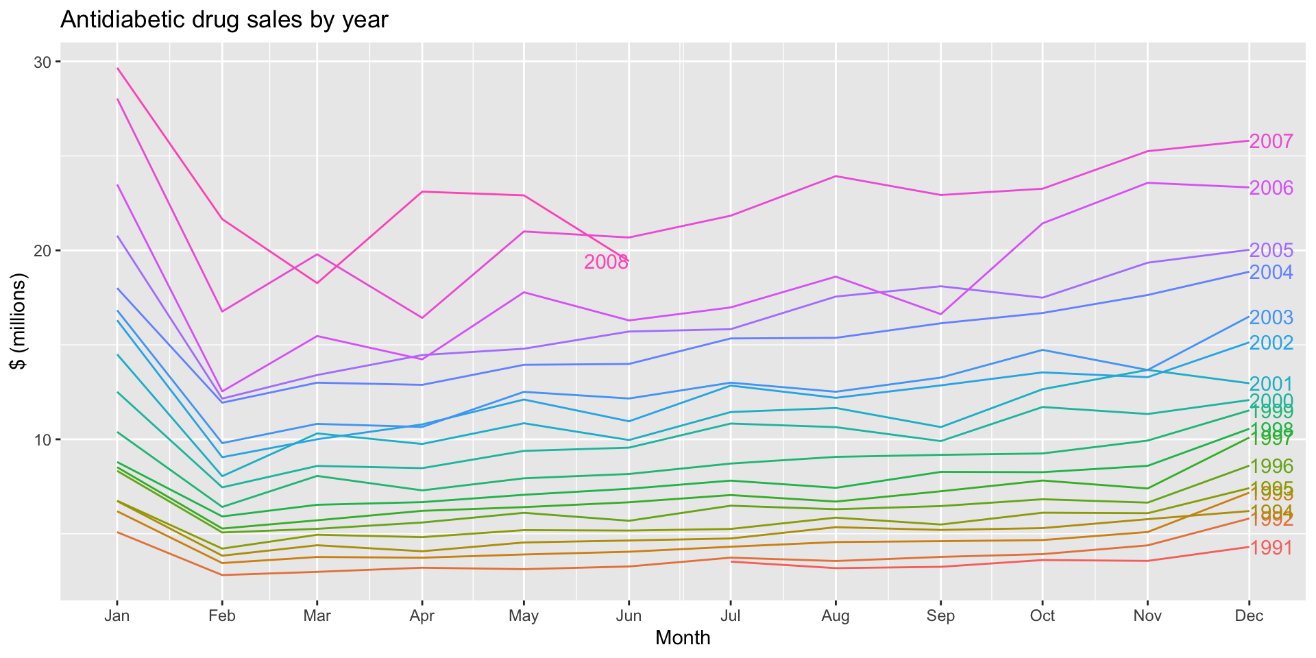
- To make a seasonal plot, use
gg_season()
- e.g.
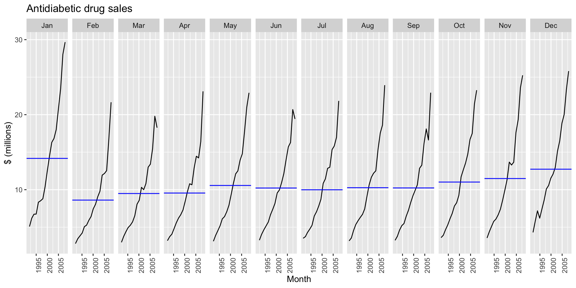
a10 |>
  gg_season(Cost, labels="right") +
  labs(y = "$ (millions)",
    title = "Antidiabetic drug sales by year")
![]()
Seasonal plots
?gg_season()gg_season will assume you want to disaggregate by the largest frequency in the tsibble by default.
Seasonal plots
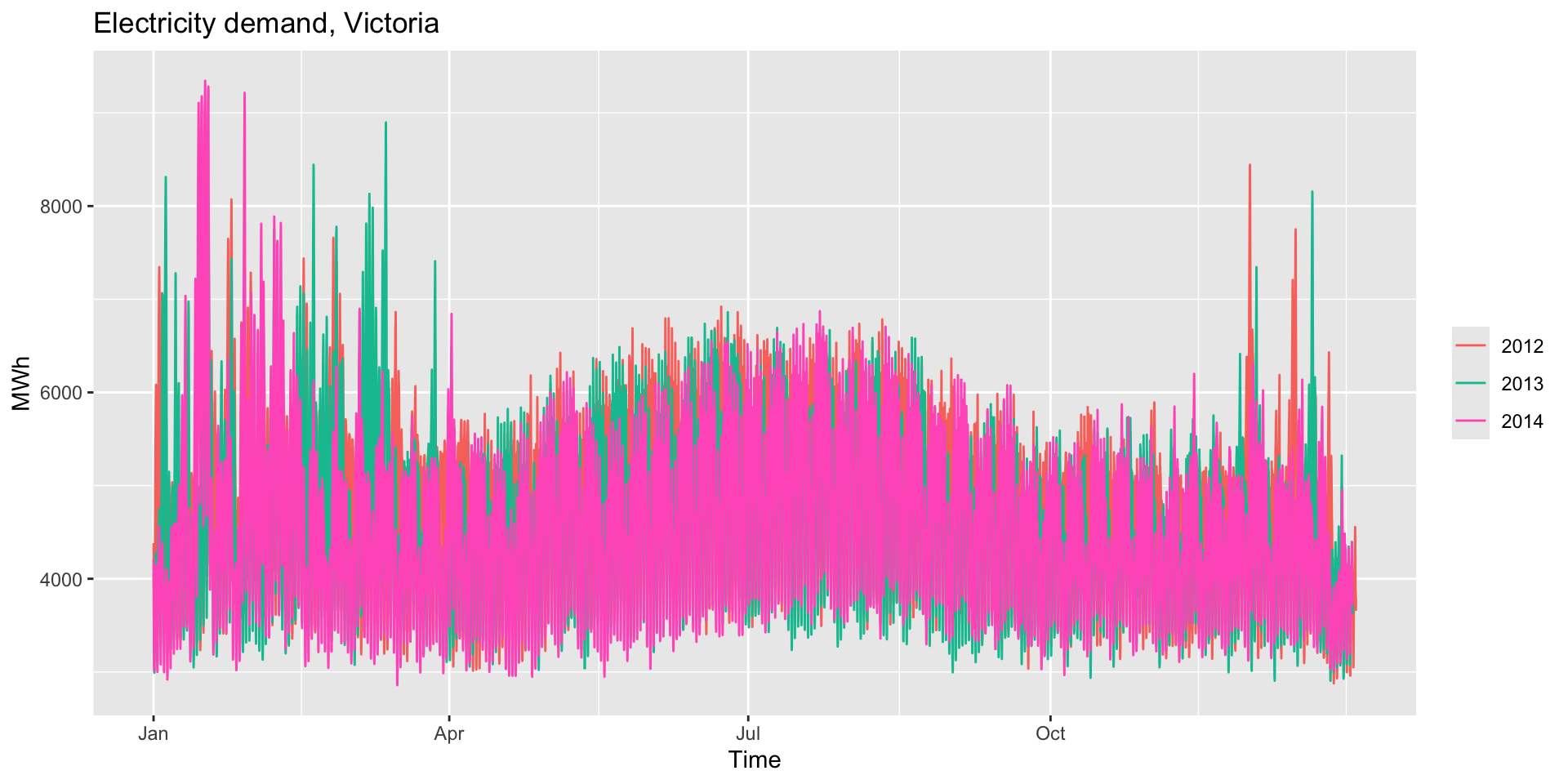
- If your time series has multiple periods, you can specify which seasonal plot you want using the
period argument.
vic_elec has half-hourly observations of electricity demand in Victoria. What does gg_season plot by default?
vic_elec |>
  gg_season(Demand) +
  labs(y="MWh", title="Electricity demand, Victoria")
![]()
Seasonal plots
- Try
head(vic_elec) to get a sense of the format of the time variable.
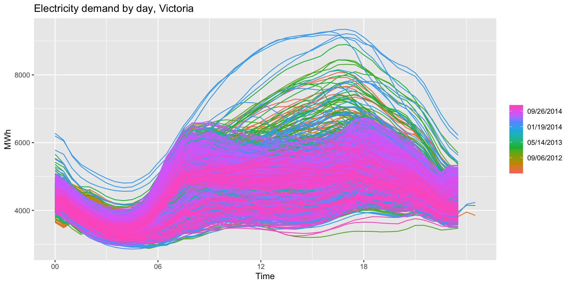
- Use the
period argument to produce a daily seasonal time plot:
vic_elec |>
  gg_season(Demand, period="day") +
  labs(y="MWh", title="Electricity demand by day, Victoria")
![]()
Seasonal plots
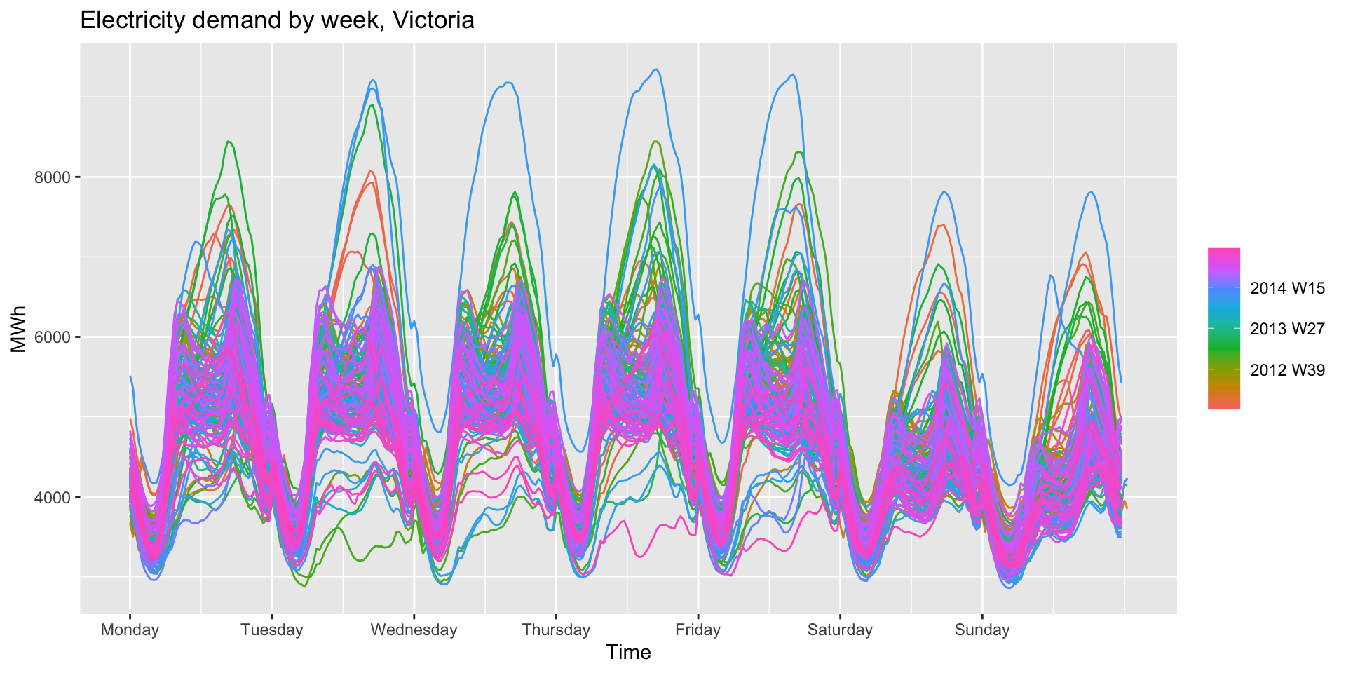
vic_elec |>
  gg_season(Demand, period="week") +
  labs(y="MWh", title="Electricity demand by week, Victoria")
![]()
Seasonal subseries plots
gg_subseries()- Plots a time series by each season within a seasonal period.
- e.g., using the antidiabetic drug sales dataset:
a10 |>
  gg_subseries(Cost) +
  labs(
    y = "$ (millions)",
    title = "Antidiabetic drug sales"
  )
Seasonal subseries plots
![]()
Exercise: holiday tourism
holidays <- tourism |>
  filter(Purpose == "Holiday") |>
  group_by(State) |>
  summarise(Trips = sum(Trips))
# A tsibble: 640 x 3 [1Q]
# Key:       State [8]
   State Quarter Trips
   <chr>   <qtr> <dbl>
 1 ACT   1998 Q1  196.
 2 ACT   1998 Q2  127.
 3 ACT   1998 Q3  111.
 4 ACT   1998 Q4  170.
 5 ACT   1999 Q1  108.
 6 ACT   1999 Q2  125.
 7 ACT   1999 Q3  178.
 8 ACT   1999 Q4  218.
 9 ACT   2000 Q1  158.
10 ACT   2000 Q2  155.
# ℹ 630 more rows
Exercise: holiday tourism autoplot
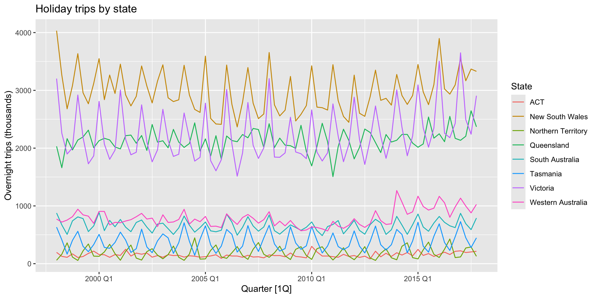
autoplot(holidays, Trips) +
  labs(y = "Overnight trips (thousands)",
  title = "Holiday trips by state")
![]()
Exercise: holiday tourism seasonal plot
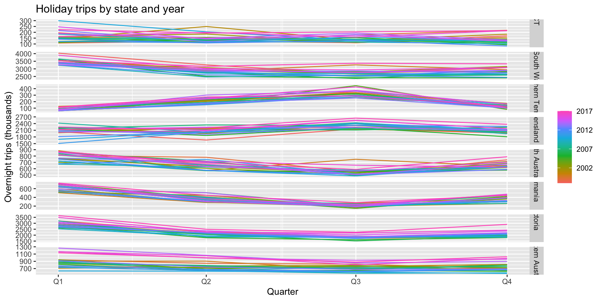
gg_season(holidays, Trips) +
  labs(y = "Overnight trips (thousands)",
  title = "Holiday trips by state and year")
![]()
Exercise: holiday tourism subseries plots
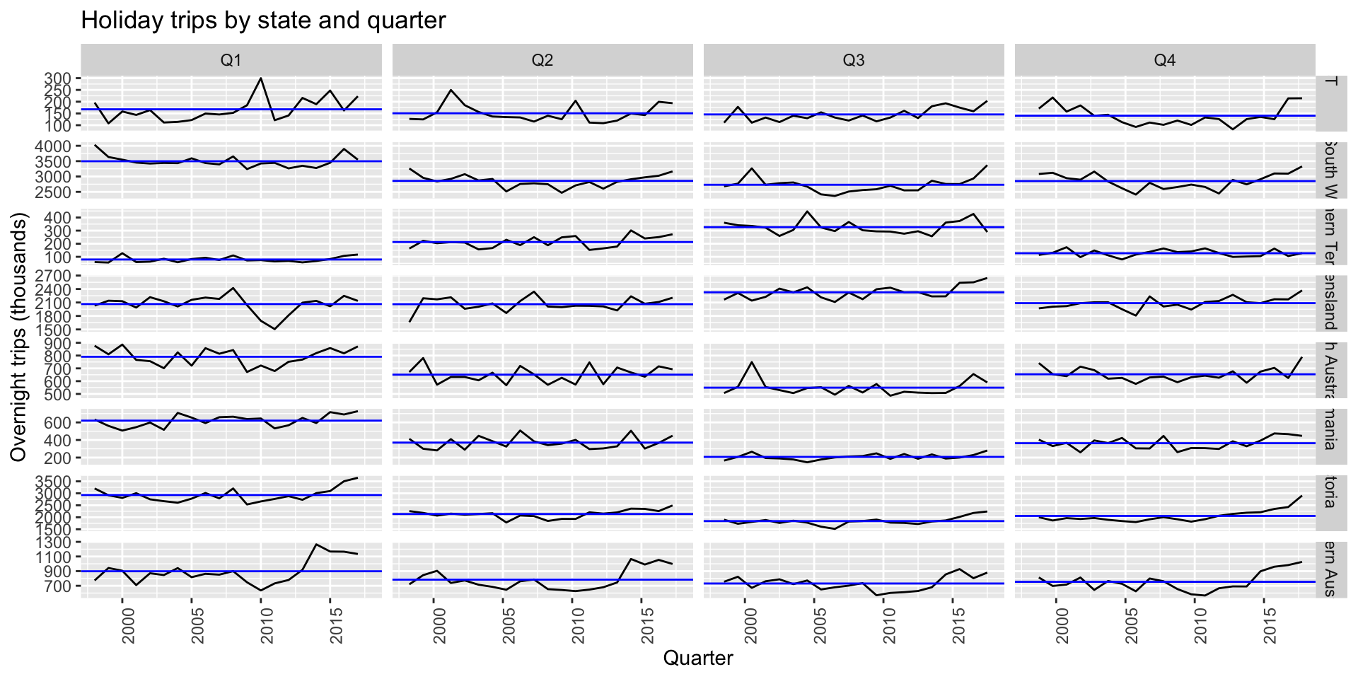
gg_subseries(holidays, Trips) +
  labs(y = "Overnight trips (thousands)",
  title = "Holiday trips by state and quarter")
![]()
Scatterplots
- Useful for visualizing relationships between variables.
Scatterplots
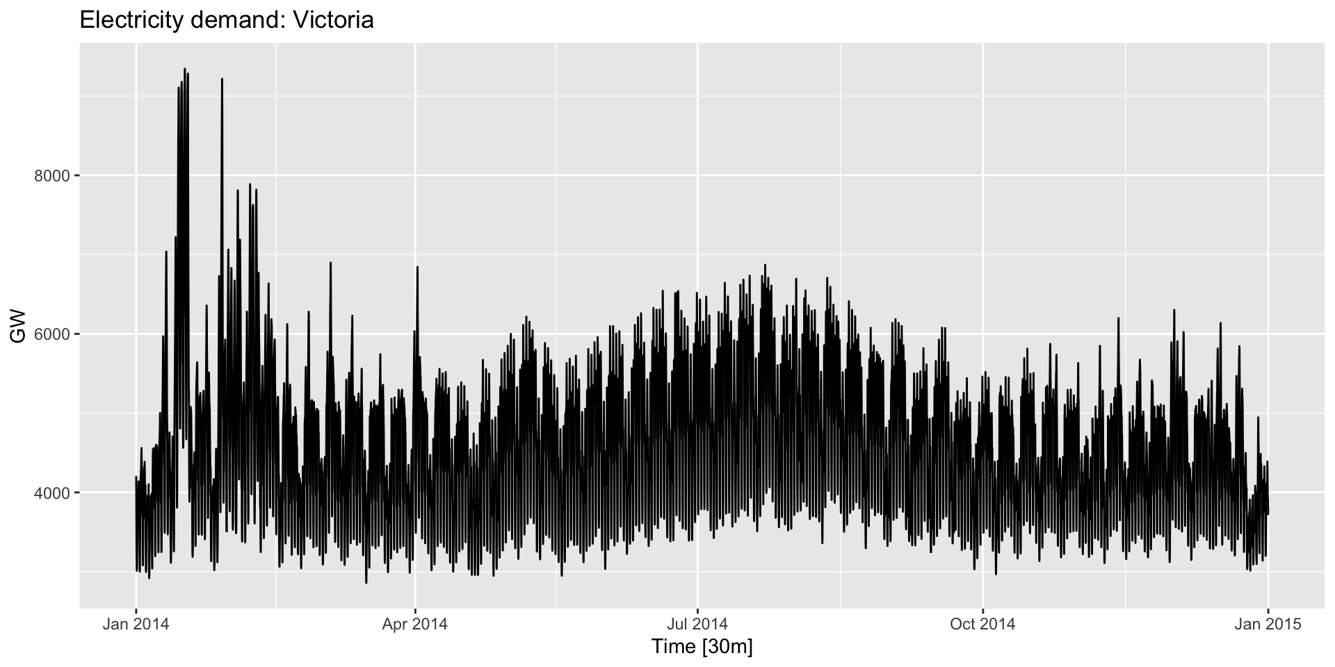
- Suppose we think electricity demand and temperature are related. Here’s demand:
![]()
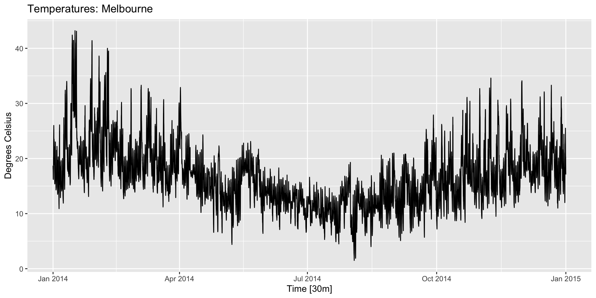
Scatterplots
![]()
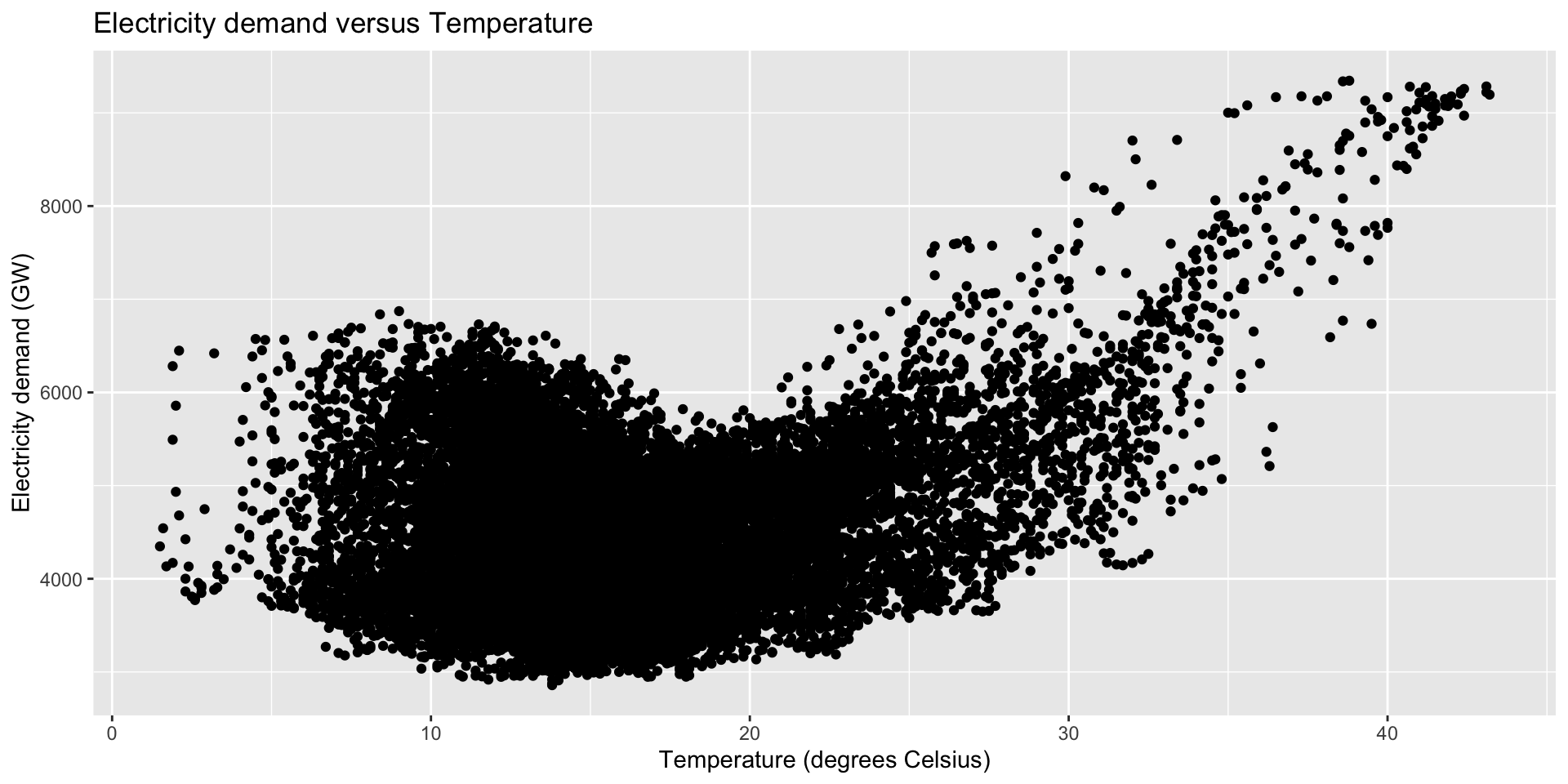
Scaterplots
vic_elec |>
  filter(year(Time) == 2014) |>
  ggplot(aes(x = Temperature, y = Demand)) +
  geom_point() +
  labs(title="Electricity demand and temperature",
       x = "Temperature (Celsius)",
       y = "Electricity demand (GW)")
![]()
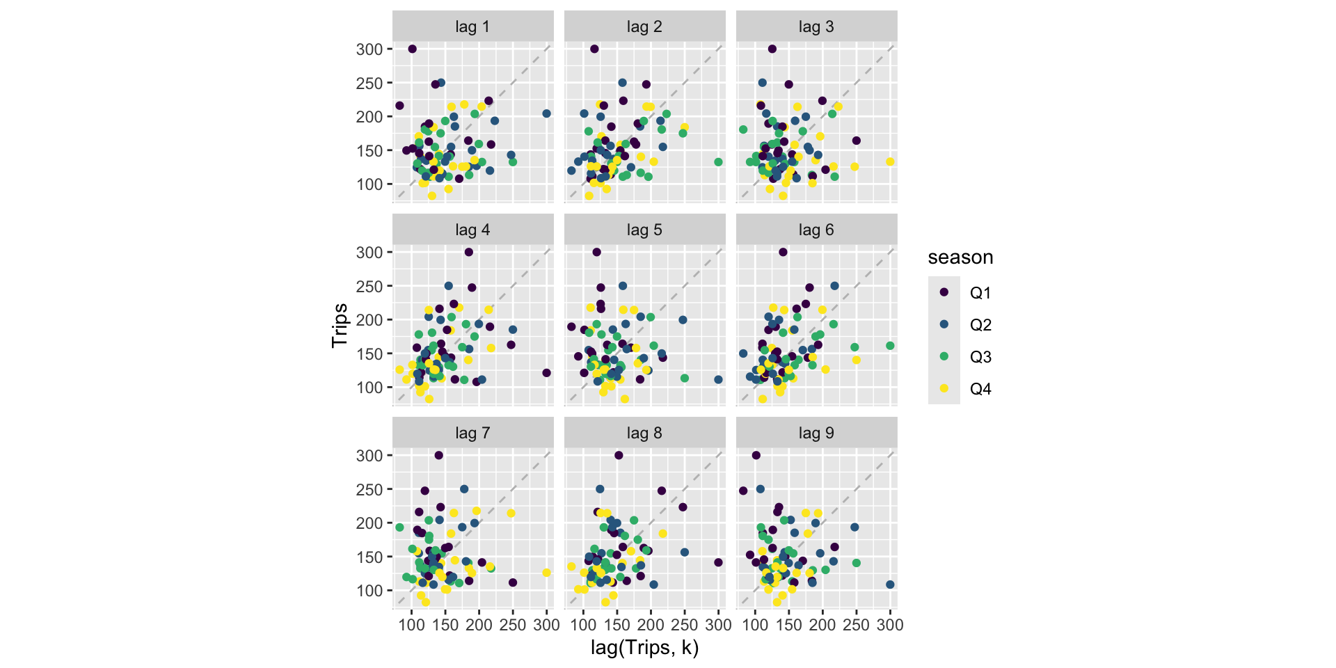
Lag plots
- Lagged values (\(y_{t-k}\)) are often useful predictors in forecasting.
- We can use
gg_lag() to get a quick sense of which might be important.
holidays |>
  filter(State == "ACT") |>
    gg_lag(Trips, geom = "point") +
    labs(x = "lag(Trips, k)")
Lag plots
![]()
Lag plots
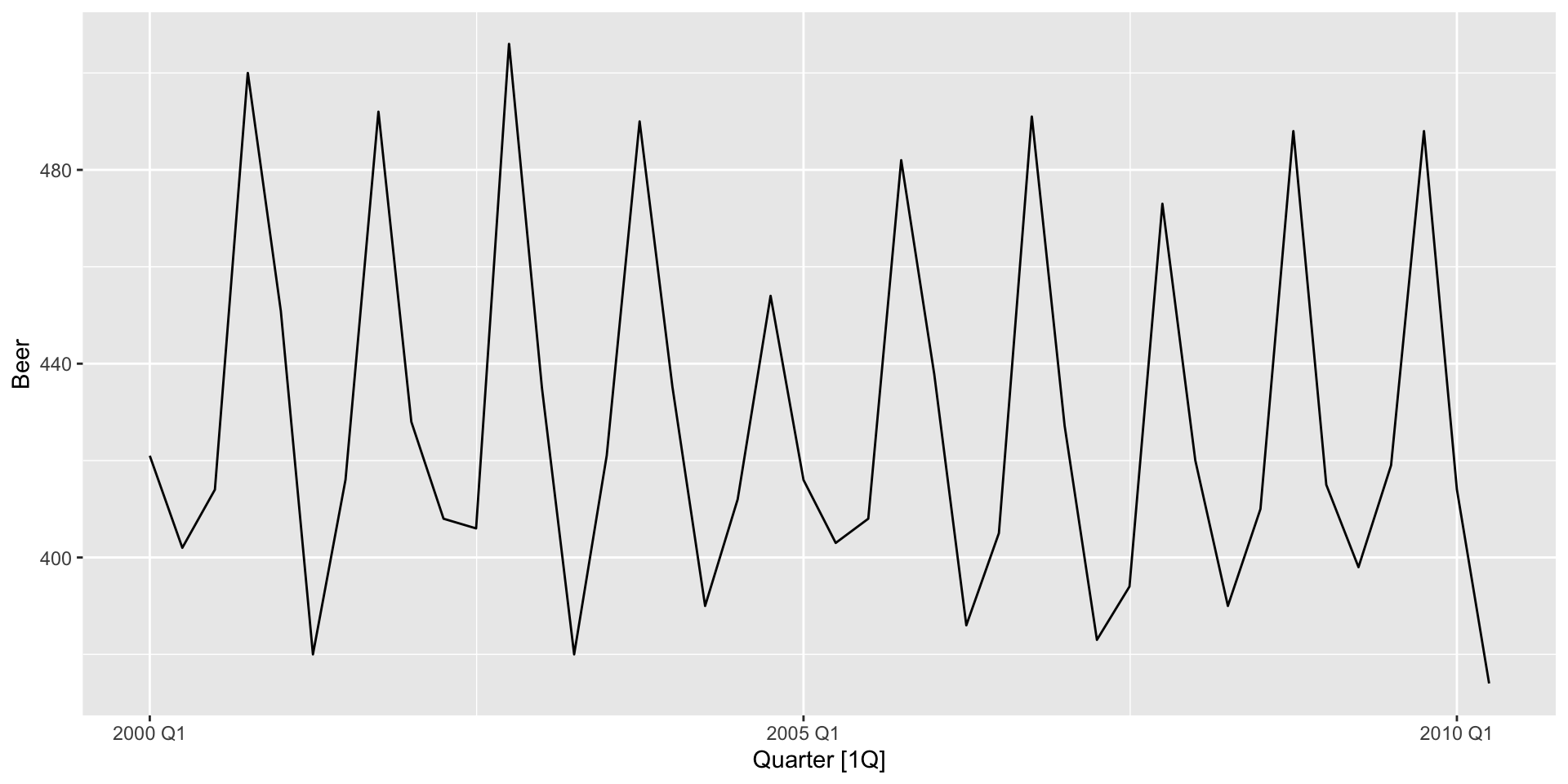
- Not much there. Let’s try another series:
recent_production <- aus_production |>
  filter(year(Quarter) >= 2000)
autoplot(recent_production, Beer)
![]()
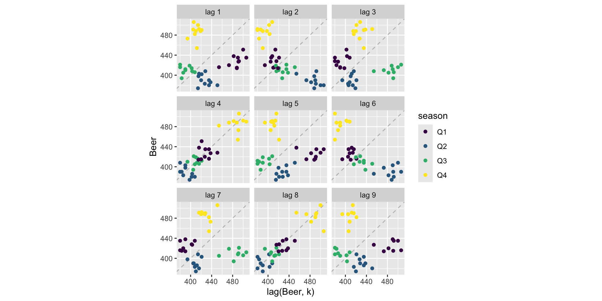
Lag plots
- There’s clear seasonality across years here. Let’s see what the lag plots say:
recent_production |>
  gg_lag(Beer, geom = "point") +
  labs(x = "lag(Beer, k)")
Lag plots
![]()
Autocorrelation and the ACF
ACF() calculates \(r_{k}\) for all \(k\) as specified by the lag_max option:
recent_production |>
  ACF(Beer, lag_max = 9)
# A tsibble: 9 x 2 [1Q]
       lag      acf
  <cf_lag>    <dbl>
1       1Q -0.0530
2       2Q -0.758
3       3Q -0.0262
4       4Q  0.802
5       5Q -0.0775
6       6Q -0.657
7       7Q  0.00119
8       8Q  0.707
9       9Q -0.0888
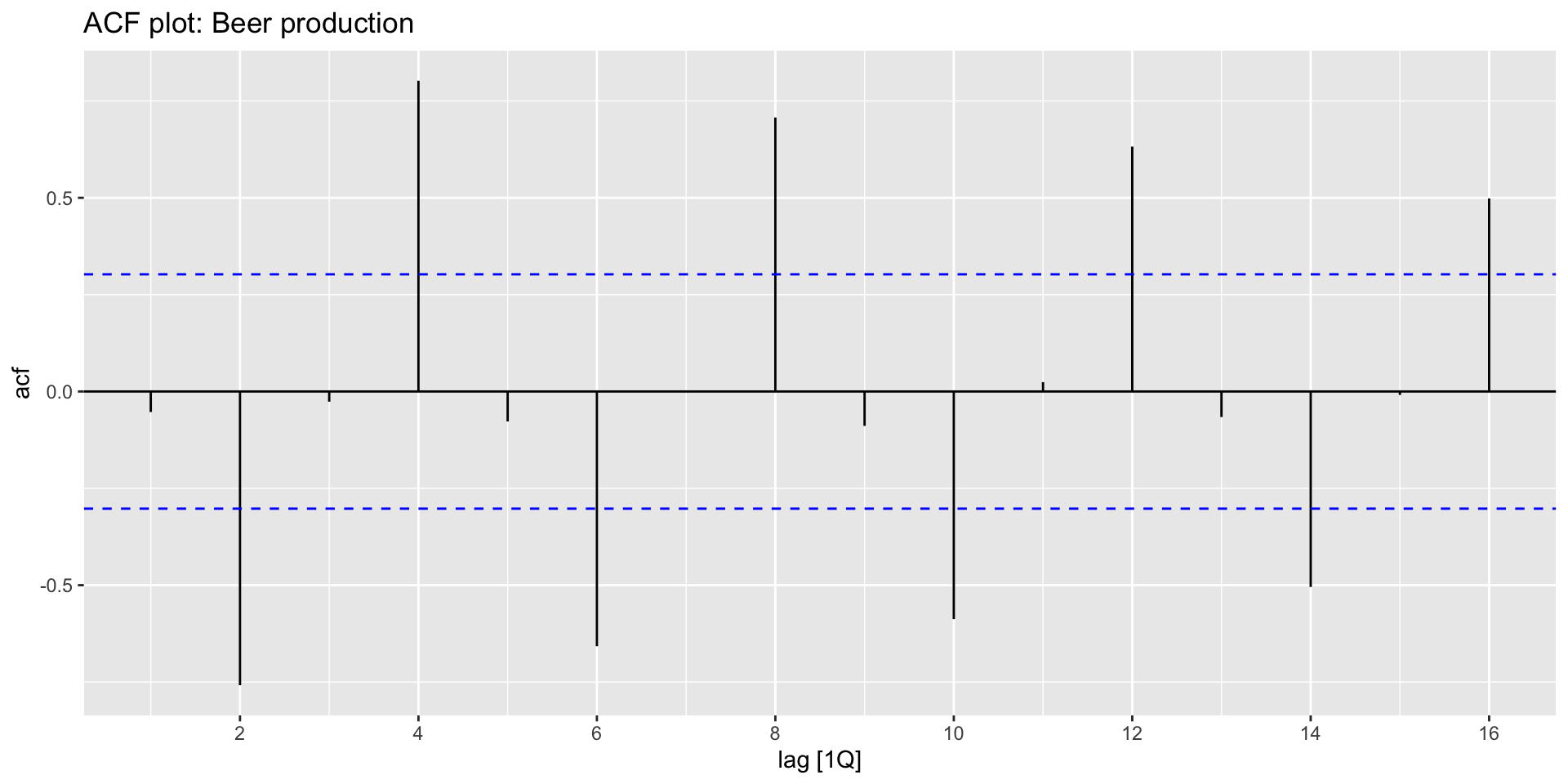
ACF plots
- We can plot the autocorrelation coefficients easily with
autoplot():
recent_production |>
  ACF(Beer) |>
    autoplot() +
    labs(title = "ACF plot: Beer production")
![]()
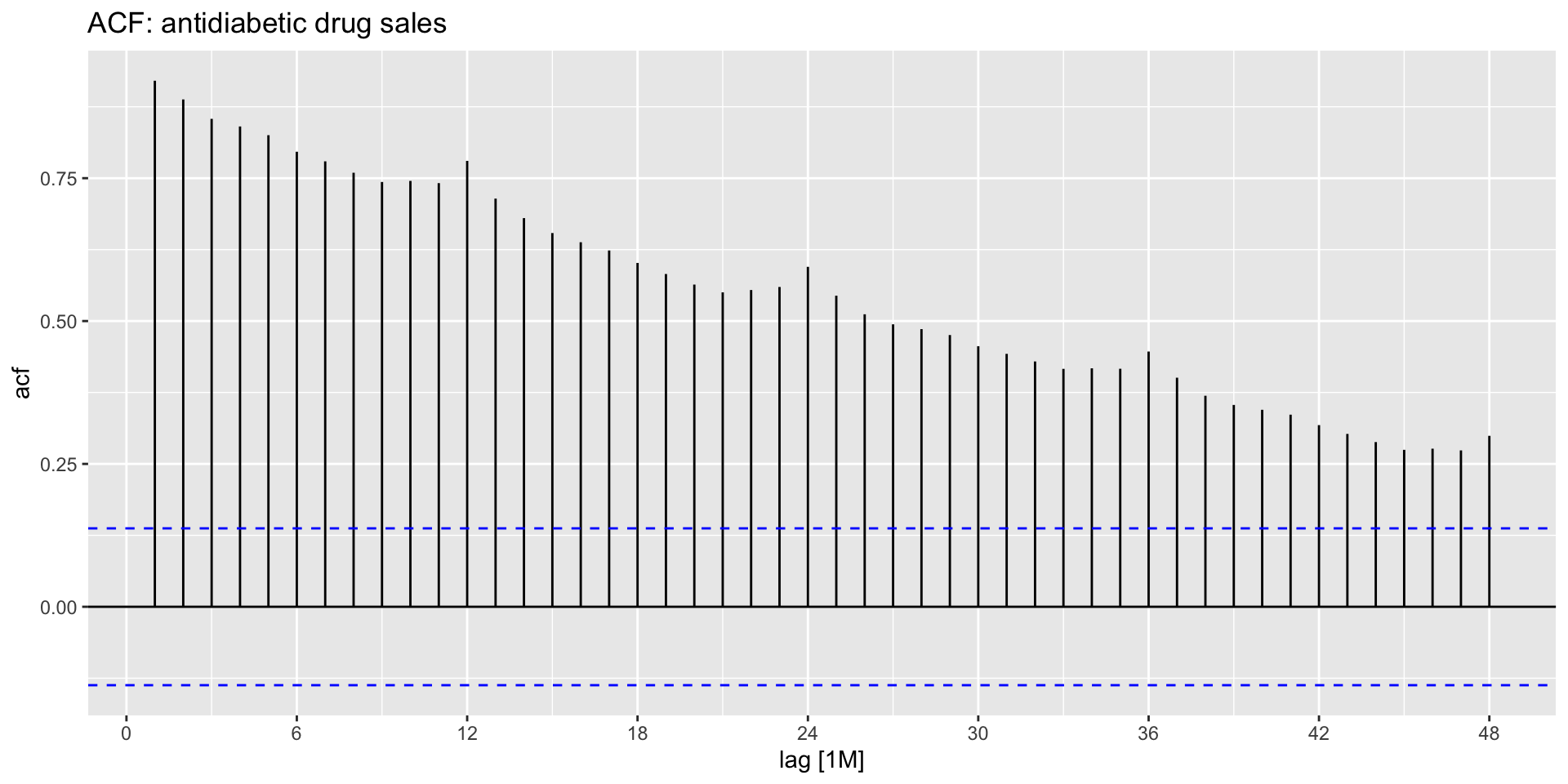
ACF plots in the presence of trend
- When there is a trend, small lags tend to have high \(r_{k}\) and large lags tend to have small \(r_{k}\):
![]()
ACF plots in the presence of seasonality
- When there is seasonality, \(r_{k}\) tend to be relatively large for the seasonal lags:
![]()
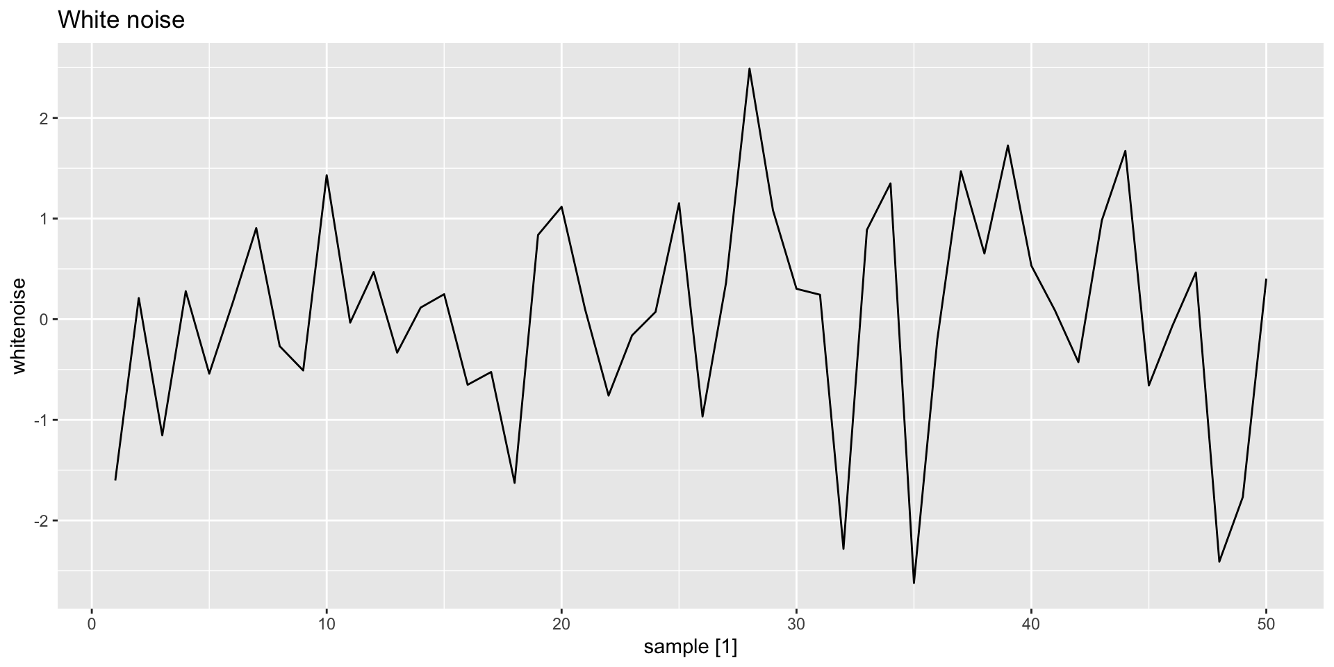
White noise
- Time series with no or little autocorrelation are called white noise:
y <- tsibble(sample = 1:50, whitenoise = rnorm(50), index = sample)
y |>
  autoplot(whitenoise) +
  labs(title = "White noise")
![]()
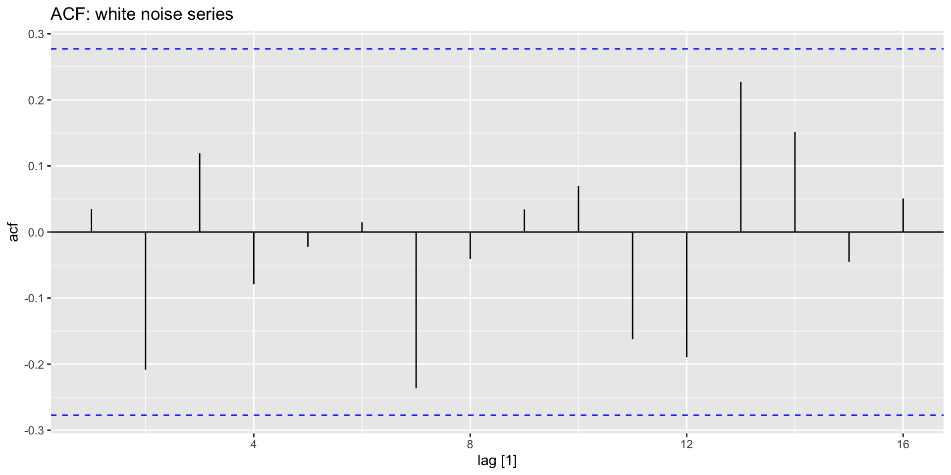
White noise ACF
- The ACF plot for a white noise series should show \(r_{k}\) of zero on average:
y |>
  ACF(whitenoise) |>
    autoplot() +
    labs(title = "ACF: white noise series")
![]()
White noise ACF
- 95% of \(r_{k}\) should lie within \(\pm \frac{1.96}{\sqrt{T}}\).
- These bounds are shown in blue below.
- Here \(T=50\), so the bounds are at \(\pm \frac{1.96}{\sqrt{50}} = \pm 0.28\). If more then 5% of the “spikes” extend beyond these bounds, it’s not a white noise series.
![]()